




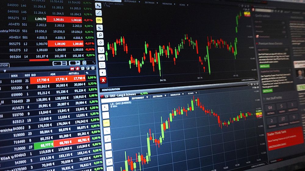

Decoding the Language of the Market: Mastering Chart Structure
The trading chart is not merely a picture of price; it is the visual record of every transaction, a tapestry woven with the threads of fear, greed, and ambition. To the uninitiated, a chart presents a chaotic labyrinth of peaks and valleys, a random walk of numbers. To the professional, it is a structured narrative, a map of market psychology written in the universal language of price and time. The first and most fundamental step to reading charts like a professional is to deconstruct this map into its essential components, understanding that every element has a purpose and a story to tell.
The most common and enduring chart type is the candlestick chart, a visualization technique refined in 18th-century Japan by rice traders. Each candlestick represents a single time period—be it a minute, an hour, a day, or a week—and encapsulates four critical pieces of data: the opening price, the closing price, the high, and the low. The rectangular body of the candle spans the distance between the open and close. A green or white body indicates a bullish period where the closing price was higher than the opening price, while a red or black body signifies a bearish period where the close was lower. The thin lines, or wicks, extending from the top and bottom of the body show the full range of price movement during that time. A long lower wick, for instance, tells a story of a period where sellers drove the price down significantly, but buyers stepped in with such force that they pushed the price back up to close near the top, a sign of rejection of lower prices.
While candlesticks are the most popular, understanding other chart types provides a broader perspective. Bar charts, also known as OHLC (Open-High-Low-Close) charts, convey the same information but use vertical bars with horizontal notches to mark the open on the left and the close on the right. Line charts, the simplest form, connect only the closing prices of each period, creating a clean, continuous line that filters out intra-period volatility to provide a clear view of the overall trend direction. Heikin-Ashi charts are a variation of candlesticks that average price data to smooth out the visual noise, making trends easier to spot. Each chart type is a different lens on the same reality; the professional chooses the lens that best illuminates the specific details they seek to analyze.
The organizing principle of any chart is its timeframe. A single chart rarely tells the whole story. The professional reads across multiple timeframes, a practice known as multi-timeframe analysis. The higher timeframe (e.g., a daily or weekly chart) provides the strategic context—the dominant, overarching trend. It answers the question, “What is the primary direction of the market?” A lower timeframe (e.g., a 15-minute or hourly chart) is then used for tactical execution, helping to pinpoint precise entry and exit points that align with the larger trend. This top-down approach ensures that a trader is not fighting the prevailing current, a common pitfall for beginners who get lost in the short-term fluctuations of a lower timeframe.
Finally, every chart’s history is defined by its market structure. This is the sequence of peaks (highs) and troughs (lows). A sustained uptrend is formally defined by a series of higher highs and higher lows. Each rally pushes above the previous peak, and each subsequent pullback bottoms out at a level higher than the last. Conversely, a downtrend is characterized by a series of lower highs and lower lows. When this sequence is broken—for instance, when a downtrend fails to make a new low and subsequently breaks above the last lower high—it signals a potential trend reversal. When the price is not making clear higher highs or lower lows but is instead oscillating between horizontal levels of support and resistance, the market is in a consolidation or ranging phase. Recognizing these structural patterns is the first and most critical skill in a professional’s analytical arsenal, as it forms the foundation upon which all other technical analysis is built.
The Grammar of the Chart: Identifying Key Patterns and Formations
Having established the basic structure, the trader begins to read the grammar of the market—the recurring patterns and formations that reveal the ongoing battle between buyers and sellers. These patterns are not mystical symbols but visual representations of supply and demand imbalances that tend to produce predictable outcomes. They are broadly categorized into support and resistance levels, classical chart patterns, and candlestick patterns.
Support and resistance are the horizontal axes of market psychology. A support level is a price zone where a downtrend tends to pause or reverse due to a concentration of buying interest. It is a floor where buyers are willing to step in and overpower sellers. A resistance level is the opposite: a price zone where an uptrend tends to stall or reverse as selling pressure overwhelms buying. It is a ceiling where sellers are eager to exit or enter short positions. These levels are not exact lines but rather zones of interest. The professional knows that a role reversal is a powerful signal: once a resistance level is decisively broken with strong volume, it often becomes a new support level, and vice versa. This is because traders who missed the initial breakout will often wait for a pullback to the old resistance level to enter the market.
Classical chart patterns are larger-scale formations that take shape over many candles and describe the price movements that occur within trends or during transitions from one trend to another. They fall into two main categories: reversal patterns and continuation patterns.
Reversal patterns signal that the prevailing trend is losing momentum and is likely to change direction. The most famous is the Head and Shoulders (H&S) pattern, which marks a top. It consists of three peaks: a central “head” that is higher than the two adjacent “shoulders.” The pattern is confirmed when the price breaks below the “neckline,” a line drawn connecting the two troughs between the peaks. This formation visually represents a climax in buying pressure followed by a gradual exhaustion. The inverse H&S is a mirror image that signals a potential bottom.
Continuation patterns, on the other hand, indicate that the market is pausing to digest its recent move before resuming in the original trend direction. The flag and pennant are short-term continuation patterns that look like a brief rest period after a sharp price move (the “flagpole”). The triangle (ascending, descending, or symmetrical) represents a compression of price action, where buyers and sellers are forming a tighter and tighter battle, often leading to a powerful breakout. The cup and handle pattern, a staple of growth stock analysis, is a bullish continuation pattern that looks like a teacup, where a “U” shaped recovery is followed by a small pullback (the “handle”) before a breakout to new highs.
At the microscopic level, candlestick patterns provide clues about the immediate balance of power. A single doji, a candle with a very small body and long wicks, signifies indecision and a balance between buyers and sellers. A hammer, with its long lower wick and small body at the top, suggests that sellers pushed the price down but were firmly rejected by buyers, a potential bullish signal. The bullish engulfing pattern, where a large green candle completely engulfs the prior red candle, is a powerful sign of a shift in momentum. While powerful, these patterns are most effective when they align with a major support/resistance level or a larger chart pattern, providing a confluence of signals that strengthens the probability of a successful trade.
The Market’s Pulse: Integrating Volume, Indicators, and Oscillators
A chart without volume is like a story without a voice; it lacks conviction and can be misleading. Volume, typically displayed as vertical bars at the bottom of the chart, represents the number of shares or contracts traded during a given time period. It is the fuel behind price movement, a measure of the strength and conviction behind a trend. The professional never analyzes price in isolation.
The core principle of volume analysis is confirmation. A healthy uptrend should be accompanied by rising volume during advances and declining volume during pullbacks. This shows that buyers are enthusiastic when the price rises and are not panicking on minor dips. A breakout above a key resistance level is far more reliable if it occurs on a significant surge in volume, as this confirms that a large number of market participants are validating the move. Conversely, a price advance on declining volume is a major red flag, suggesting the trend is running on fumes and is vulnerable to a reversal. A high-volume breakout below a support level is a sign of strong conviction among sellers. Professional traders also watch for volume spikes or “climaxes” at the end of a long trend, which can signal exhaustion and a potential turning point.
Beyond volume, traders use technical indicators to mathematically transform price and volume data, aiming to clarify trends and identify hidden dynamics. Indicators are broadly divided into two types: trend-following and oscillators.
Moving averages (MAs) are the most fundamental trend-following indicators. A simple moving average (SMA) calculates the average price over a specified period. The 50-day and 200-day MAs are watched by institutions and retail traders alike. When the price is above a rising 200-day MA, the long-term trend is considered bullish. A powerful signal occurs when a shorter-term MA crosses above a longer-term MA, known as a golden cross, signaling a potential long-term uptrend. The opposite is a death cross, which can signal a bearish trend. MAs act as dynamic support and resistance levels; in a strong uptrend, the price will often bounce off a rising 50-day MA.
Oscillators, in contrast, are “leading” indicators that move within a bounded range (e.g., 0 to 100) and are designed to identify overbought or oversold conditions, potential momentum shifts, and divergences. The Relative Strength Index (RSI) measures the speed and change of price movements. An RSI reading above 70 is typically considered “overbought” and below 30 is “oversold,” though in strong trends, these levels can be misleading. The true power of the RSI is revealed in divergence. A bearish divergence occurs when the price makes a higher high but the RSI makes a lower high. This signals that the underlying momentum is waning, even though the price is still rising—a powerful warning of a potential reversal. The MACD (Moving Average Convergence Divergence) indicator uses two moving averages to identify trend direction and momentum. Its signal line crossovers and divergences from price provide valuable clues. While powerful, oscillators are most effective when used to confirm the story being told by price action and other indicators, not in isolation.
The Professional’s Workflow: Synthesizing Data into a Cohesive Strategy
The journey from novice to professional is marked by the ability to synthesize all these disparate elements—structure, patterns, volume, and indicators—into a single, cohesive market narrative. This is not a simple checklist but a disciplined, top-down analytical process that forms the bedrock of a professional’s trading strategy. It is the art of confluence.
The professional trader begins their analysis at the highest level of abstraction: the larger timeframes. The first look is at the weekly or monthly chart to answer the most important question: what is the dominant trend? Is the market in a long-term uptrend, adding to a position? Is it in a downtrend, looking to sell rallies? Or is it trapped in a wide-ranging consolidation? This establishes the primary bias. A professional trader wants to trade in alignment with this dominant trend because it provides the wind at their back.
Next, the analysis drills down to the intermediate timeframe, such as the daily chart. Here, the trader assesses the current state of the dominant trend. Is the trend healthy? Are there signs of exhaustion? They identify the key levels of support and resistance that define the current trading range. They look for significant patterns that could be forming—a large consolidation, a potential reversal pattern like a Head and Shoulders, or a continuation pattern like a flag.
Only then does the trader move to the short-term timeframe, such as the 4-hour or 1-hour chart, for execution. This is where the final piece of the puzzle is assembled. The short-term chart is used to pinpoint low-risk, high-probability entry points. For a trader with a bullish bias from the higher timeframes, they will wait for a pullback on the lower timeframe, for instance, to a key support level identified on the daily chart. They will then look for a bullish candlestick pattern (like a hammer or an engulfing pattern) at that support level, confirmed by a bullish divergence in an oscillator like the RSI and supported by strong buying volume. The confluence of signals—the larger trend, the key level, the candlestick pattern, the indicator confirmation—is what gives the professional the confidence to execute the trade. The final step is risk management, where they define the trade’s invalidation point. Where will they place their stop-loss? A logical stop-loss is typically placed just beyond the technical structure that justifies the trade—below the support level, for example. They then calculate their position size based on this risk, ensuring that no single trade can jeopardize their entire capital. This entire process, repeated with discipline and patience, transforms the act of reading a chart from a simple observation into a rigorous, rational, and professional practice, turning the chaos of the market into an organized, navigable map of opportunity.

