




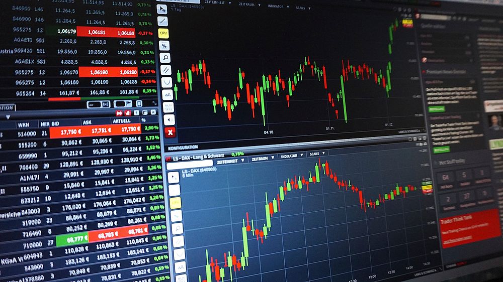

Decoding Market Structure: The Foundation of Silver Chart Analysis
Professional trading of silver (XAG/USD) begins not with indicators, but with a forensic understanding of market structure. Unlike equities, the silver market is influenced by industrial demand, monetary policy, and safe-haven flows, creating a unique price architecture. A pro trader first identifies the dominant trend on the daily and weekly timeframes. This is achieved by marking swing highs and swing lows. An uptrend is defined by a series of higher highs and higher lows; a downtrend by lower highs and lower lows. When price action breaks this sequence—for instance, failing to make a new high and then breaking below the previous swing low—a structural shift is confirmed. This initial step prevents the fatal error of counter-trend trading. The professional then overlays horizontal support and resistance zones derived from historical price clusters, not single lines. These zones are areas where institutional order flow previously reversed price. For silver, round numbers like $20, $25, and $30 per ounce often act as psychological barriers, but the true zones are defined by volume-at-price and prior consolidation ranges. A weekly close above a major resistance zone signals a high-probability breakout, while a daily rejection wick from that same zone signals a potential reversal. Mastery of structure alone eliminates 80% of retail trading mistakes.
Timeframe Synchronicity: The Three-Screen System
A pro never analyzes silver on a single timeframe. The standard methodology is the three-screen system: weekly (macro trend), daily (intermediate trend and setup), and 4-hour or 1-hour (entry timing). The weekly chart reveals the primary trend and major institutional positioning. For example, if the weekly chart shows silver in a secular bull market above its 30-week moving average, the trader only looks for long setups on lower timeframes. The daily chart identifies the current phase—accumulation, markup, distribution, or markdown. A pro looks for specific patterns on the daily: a failed breakdown (spring) below a support zone, followed by a strong bullish engulfing candle, often precedes a significant rally. The intraday chart (1-hour or 15-minute) provides the trigger. Here, the trader watches for a micro-structure break—like a bullish order block or a liquidity sweep of Asian session lows—aligned with the daily bias. The golden rule: never let a 15-minute signal override a weekly trend. If the weekly is bearish and the daily is showing a bear flag, a 1-hour bullish divergence is a trap, not a trade. This synchronicity filters noise and aligns the trader with the dominant capital flow.
Volume and Open Interest: The Institutional Footprint
Price is the what; volume and open interest (OI) are the why. Silver futures (COMEX) and the iShares Silver Trust (SLV) provide reliable volume data. A pro trader never trusts a breakout without confirming volume. A genuine breakout above a resistance zone on the daily chart must be accompanied by volume at least 1.5x the 20-period average. Low-volume breakouts are traps—often bull or bear traps designed to capture retail stops. Open interest adds another dimension. Rising price + rising OI = strong uptrend (new money entering long). Rising price + falling OI = weak uptrend (short covering, not new buying). Falling price + rising OI = strong downtrend (new shorts). Falling price + falling OI = weak downtrend (long liquidation, potential bottom). For silver, watch for volume spikes at key reversal points. A massive volume spike with a long upper wick at a resistance zone indicates institutional selling (distribution). Conversely, a volume spike with a long lower wick at support indicates accumulation. Pros also monitor the Commitment of Traders (COT) report weekly. When commercial hedgers (producers) are massively net short and non-commercials (speculators) are massively net long, a top is near. The inverse signals a bottom. This data is not for timing but for context—it tells you when the crowd is wrong.
Moving Averages: Dynamic Support and The 200-Day Rule
Moving averages are not magic lines; they are dynamic representations of average cost basis. The pro trader uses three key moving averages on silver: the 20-period EMA (for short-term momentum), the 50-period SMA (for intermediate trend), and the 200-period SMA (for long-term trend). The 200-day SMA is the institutional line in the sand. When silver trades above its 200-day SMA, the long-term bias is bullish; below, bearish. A pro never takes a long trade when price is below the 200-day SMA unless a major structural reversal is confirmed. The 50-day SMA acts as a mean reversion level in strong trends. In a bull market, silver often pulls back to the 50-day SMA, bounces, and continues higher. The 20-day EMA is for timing entries. When the 20 EMA crosses above the 50 SMA (golden cross) and price is above the 200 SMA, a high-probability long setup exists. The dead cross (20 below 50) below the 200 SMA signals short setups. However, moving averages lag. Pros use them as confluence, not as standalone signals. A better approach is to combine the 200 SMA with a Fibonacci retracement. If silver pulls back to the 61.8% Fibonacci level and simultaneously touches the 200 SMA, the probability of a bounce is extremely high. This is called a “confluence zone.”
Candlestick Patterns and Wyckoff Logic
Japanese candlesticks reveal the battle between buyers and sellers. For silver, certain patterns carry more weight due to the market’s volatility. The pin bar (hammer or shooting star) at a key support/resistance zone is the highest-probability reversal signal. A hammer with a long lower wick, occurring after a downtrend and touching a support zone, indicates sellers tried and failed to push price lower. The pro waits for the next candle to close above the hammer’s high for confirmation. The engulfing candle—where the current candle’s body completely covers the previous candle’s body—signals a shift in momentum. A bullish engulfing at support is a buy signal; a bearish engulfing at resistance is a sell signal. The doji, especially a long-legged doji, indicates indecision and often precedes a breakout. Pros combine these with Wyckoff logic. In accumulation, silver forms a trading range with a spring (false breakdown) and a test (higher low). In distribution, it forms an upthrust (false breakout) and a sign of weakness (lower high). The pro trader marks these phases on the chart. When a spring occurs and volume dries up on the test, the trader prepares for a markup. When an upthrust occurs with high volume and a bearish close, the trader prepares for a markdown. This is the core of reading silver like an institutional order flow analyst.
RSI and Divergence: Momentum’s Hidden Message
The Relative Strength Index (RSI) is not an overbought/oversold signal generator for pros. It is a momentum divergence tool. In a strong silver uptrend, RSI can stay above 70 for weeks. Selling just because RSI is overbought is a rookie mistake. The pro looks for bearish divergence: price makes a higher high, but RSI makes a lower high. This indicates weakening momentum and often precedes a correction. Conversely, in a downtrend, bullish divergence occurs when price makes a lower low, but RSI makes a higher low. The most powerful signals occur when divergence appears at a major support or resistance zone. For example, if silver is testing a weekly resistance zone and the daily RSI shows bearish divergence, the probability of a reversal is high. The pro then waits for a bearish candlestick confirmation (like a shooting star) before entering a short. RSI can also be used with a 14-period setting and a 50-level midline. When RSI crosses above 50, momentum is bullish; below 50, bearish. In a range-bound silver market, RSI can be used to buy at 30 and sell at 70, but only if the range is well-defined. The key is to never use RSI in isolation. Combine it with volume and structure.
Fibonacci Retracements and Extensions: Mapping the Roadmap
Fibonacci retracement levels are not mystical; they are based on the mathematical ratio of previous price swings. For silver, the key levels are 38.2%, 50%, 61.8%, and 78.6%. A pro trader draws Fibonacci from a major swing low to a major swing high (for an uptrend) and watches for price to pull back to these levels. The 61.8% level (golden ratio) is the most reliable for a bounce in a trending market. If silver pulls back to 61.8% and simultaneously touches a moving average or a prior support zone, the trader looks for a long entry. The 50% level is also significant, especially in silver’s volatile swings. Extensions (127.2%, 161.8%, 261.8%) are used for profit targets. In a strong uptrend, silver often reaches the 161.8% extension before a major correction. The pro trader will scale out of positions at these extensions. A critical rule: Fibonacci levels are only valid if the initial swing was a clear impulse move (strong trend) and not a choppy range. If the swing is messy, Fibonacci levels are unreliable. Also, always align Fibonacci with structure. A 61.8% retracement that coincides with a broken resistance zone (now support) is a high-conviction setup. A 61.8% retracement in the middle of nowhere is a guess.
The Role of the US Dollar and Real Yields
Silver is priced in US dollars, so the dollar index (DXY) and real yields (10-year TIPS) are the macro drivers. A pro trader never analyzes silver in isolation. The correlation between silver and the DXY is strongly negative. When the DXY breaks out above a resistance zone, silver often breaks down. When the DXY breaks down, silver rallies. However, this correlation is not perfect. In periods of extreme risk-off (e.g., a banking crisis), both silver and the dollar can rise as safe havens. The pro trader watches the DXY chart alongside silver. If silver is testing a resistance zone and the DXY is testing a support zone, a simultaneous breakout in both (silver up, dollar down) confirms the silver long. Real yields are even more important. Silver pays no yield. When real yields (nominal yield minus inflation) are negative or falling, silver becomes more attractive. The pro trader overlays the 10-year TIPS yield on the silver chart. A falling real yield trend is a tailwind for silver. A sharp rise in real yields is a headwind. The pro also watches the gold/silver ratio. When the ratio is above 80, silver is historically cheap relative to gold. When it is below 50, silver is expensive. A mean reversion in the ratio often signals a silver outperformance phase. This macro context prevents the trader from fighting the Federal Reserve.
Building a Professional Chart Layout
A pro trader’s silver chart is clean and purposeful. It contains: (1) Price action with candlesticks on a white or black background. (2) Three moving averages: 20 EMA, 50 SMA, 200 SMA. (3) Volume bars with a 20-period moving average. (4) RSI (14) with divergence lines drawn manually. (5) Horizontal support/resistance zones (rectangles, not lines). (6) Fibonacci retracement levels from the most recent major swing. (7) The DXY or 10-year TIPS yield as an overlay (using a separate pane or a correlation coefficient). (8) The gold/silver ratio in a separate window. No more than 5-7 indicators. The pro avoids clutter like MACD, Stochastic, Bollinger Bands, and Ichimoku simultaneously. Less is more. The trader also sets alerts at key zones. For example, an alert when silver touches a weekly resistance zone, or when RSI crosses 70 or 30, or when the 20 EMA crosses the 50 SMA. This allows the trader to monitor multiple markets without staring at screens. The final element is a trading journal. The pro records every trade with a screenshot of the chart at entry and exit, noting the structure, volume, and confluence. Over time, this journal reveals which patterns work best for silver’s unique volatility.
Risk Management and Position Sizing for Silver
Silver is one of the most volatile commodities, with daily swings of 3-5% being common. A pro trader never risks more than 1-2% of account equity per trade. Position sizing is calculated based on the distance from entry to stop-loss. For example, if the stop-loss is $0.50 away from entry and the account is $10,000 with a 1% risk ($100), the position size is 200 ounces (100 / 0.50). The stop-loss is always placed beyond a structural level, not at an arbitrary dollar amount. A long trade entered at support with a stop below the recent swing low is logical. A stop just below a round number like $22.00 is likely to be hunted by stop-loss raids. The pro places stops 1-2 cents below the swing low to avoid liquidity sweeps. Take-profit levels are set at the next major resistance zone or Fibonacci extension. The pro uses a risk-reward ratio of at least 1:2. If the stop is $0.50, the target must be at least $1.00 away. For silver, trailing stops are effective in strong trends. The pro trails the stop below each new higher low on the 4-hour chart. Finally, the pro never adds to a losing position. Averaging down is the fastest way to blow up a silver account. If the trade moves against the analysis, the pro exits and waits for a new setup. Discipline in risk management is what separates a pro from a gambler. The chart is a map, but the stop-loss is the seatbelt.

