





How to Read Stock Charts for Smarter Trading Decisions
Stock charts are the primary language of the market. Every candle, bar, and line encodes the collective decisions of millions of buyers and sellers. Learning to decode that language transforms trading from guesswork into a structured, evidence-based process. The sections below walk through chart types, timeframes, price action, indicators, volume, patterns, and risk context, giving you a complete framework for reading stock charts with confidence.
Understanding the Four Core Chart Types
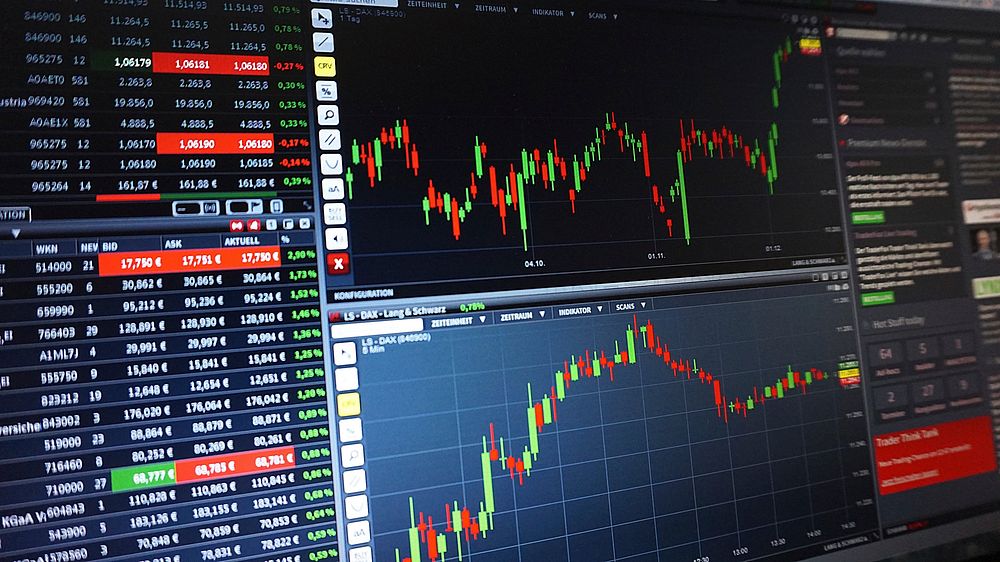
Candlestick charts dominate modern trading because each candle displays four data points: the open, high, low, and close (OHLC). The rectangular body spans the distance between open and close, while thin wicks (shadows) mark the session’s high and low. A green or white body means the close finished above the open; a red or black body means the close finished below it. Bar charts convey identical information using vertical lines with small horizontal ticks for open and close. Line charts plot only closing prices, producing a clean visual of trend direction but omitting intrabar detail. Heikin-Ashi charts average price data across periods, smoothing noise at the cost of delayed signals. For most traders, candlesticks offer the best balance of detail and readability.
Why Timeframes Shape Every Decision
A single stock can appear bullish on one timeframe and bearish on another. The daily chart reveals the primary trend, the weekly chart exposes the macro trend, and the 5-minute chart captures intraday momentum. A practical hierarchy: use the weekly chart to determine the dominant direction, the daily chart to identify trade setups, and intraday charts only for precise entry and exit timing. When timeframes conflict, the higher timeframe generally wins. A daily uptrend pulling back on the hourly chart is a potential buying opportunity; an hourly bounce inside a weekly downtrend is often just noise.
Reading Price Action Without Indicators
Before adding any indicator, learn to read raw price. Trend identification begins with swing highs and swing lows. An uptrend prints higher highs and higher lows. A downtrend prints lower highs and lower lows. A rangebound market oscillates between defined support and resistance without progress. Support is a price zone where buying has previously overwhelmed selling; resistance is where selling has capped rallies. These zones are areas, not exact lines, and their significance grows with the number of times price has reacted there. When support breaks decisively, it often becomes new resistance, and vice versa. This role reversal is one of the most reliable concepts in technical analysis.
Candlestick Patterns That Matter
Not every formation deserves attention. Focus on patterns that signal a shift in supply and demand. A doji, with open and close nearly equal, signals indecision and often precedes a reversal when it appears after an extended move. A hammer shows sellers driving price down intraday before buyers reclaim the range, a bullish signal at support. A shooting star is its mirror image, warning of exhaustion at resistance. Engulfing patterns occur when a candle’s body completely covers the prior candle’s body in the opposite direction, indicating a decisive change in control. Three white soldiers and three black crows confirm trend continuation. Context is everything: a hammer in the middle of a range means little, but a hammer at tested support after a downtrend carries weight.
The Indispensable Role of Volume
Price tells you what happened; volume tells you how much conviction backed it. A breakout above resistance on volume twice the average is far more trustworthy than one on thin volume, which frequently fails and traps buyers. Rising price with rising volume confirms an uptrend. Rising price with falling volume suggests weakening demand. Climax volume at the end of a long trend often marks exhaustion. On pullbacks, declining volume indicates healthy profit-taking rather than distribution. Always check volume against its 20-day average before acting on any breakout or breakdown.
Moving Averages as Dynamic Support
Moving averages smooth price data into a single flowing line. The 50-day and 200-day simple moving averages are the most watched. Price above a rising 200-day average defines a long-term uptrend; price below a falling one defines a downtrend. The 50-day average often acts as dynamic support in strong uptrends. Crossovers matter too: the 50-day crossing above the 200-day, known as a golden cross, signals strengthening momentum, while the opposite death cross warns of weakness. Keep in mind that moving averages lag by design, so they confirm trends rather than predict turns.
Momentum Indicators: RSI and MACD
The Relative Strength Index (RSI) measures the speed of price changes on a 0–100 scale. Readings above 70 suggest overbought conditions; below 30 suggests oversold. In strong trends, however, RSI can remain extreme for weeks, so treat it as a momentum gauge rather than a standalone sell or buy trigger. Divergence is more powerful: when price makes a new high but RSI makes a lower high, momentum is fading. The Moving Average Convergence Divergence (MACD) plots the gap between two moving averages and a signal line. Bullish crossovers, where the MACD line crosses above the signal line, support long entries; bearish crossovers support exits. Combine momentum signals with price structure for higher-probability trades.
Chart Patterns and Breakouts
Classical patterns reflect recurring crowd psychology. Head and shoulders marks a topping structure with three peaks, the middle highest, and a neckline that triggers the breakdown. Inverse head and shoulders marks a bottom. Triangles, flags, and pennants represent consolidation before continuation. Cup and handle formations often precede sustained advances. The measurable move after a breakout typically equals the pattern’s height projected from the breakout point. Volume confirmation remains mandatory. False breakouts, where price briefly pierces a level then reverses, are common; waiting for a daily close beyond the level reduces whipsaw risk.
Support, Resistance, and Trendlines
Draw trendlines by connecting at least two swing lows in an uptrend or two swing highs in a downtrend; a third touch validates the line. Channels add a parallel line on the opposite side, framing the tradeable range. Horizontal levels derived from prior highs, lows, and gaps often outperform diagonal lines because they represent unambiguous price memory. Mark the levels where the largest volume traded, since those zones contain the most committed participants and tend to produce the strongest reactions.
Putting It Together: A Repeatable Workflow
Begin with the weekly chart to establish trend. Drop to the daily chart to locate support, resistance, and moving averages. Check volume behavior across recent sessions. Add RSI and MACD to assess momentum. Identify whether price sits at a decision point: a breakout, a pullback to support, or a pattern completion. Define your entry, stop placement below the nearest invalidation level, and profit target based on the next resistance zone. Calculate position size so a losing trade risks only a small fixed percentage of capital. Then execute and record the outcome.
Risk Management Is Part of Chart Reading
Charts inform decisions, but survival depends on risk control. Never enter a trade without a predefined exit. A stop-loss placed just beyond a swing low or below a breakout level keeps losses small and objective. Risk-to-reward ratios of at least 1:2 ensure that even a modest win rate remains profitable. Position sizing based on dollar risk, not emotion, prevents any single chart reading from damaging your account.
Common Mistakes to Avoid
Trading against the higher timeframe, chasing extended candles, ignoring volume, overloading a chart with indicators, and moving stop-losses to avoid taking a loss are the errors that erode accounts fastest. Simplicity wins: two or three indicators, clean levels, and disciplined execution outperform cluttered screens and impulsive decisions. Reviewing past charts weekly accelerates pattern recognition faster than any course.
Final Framework for Smarter Trading
Read trend first, levels second, momentum third, and volume always. Let price action lead and indicators confirm. Treat every chart as a probability map rather than a prophecy, and let risk management carry the weight of uncertainty. Consistent, patient application of these principles turns stock charts from intimidating squiggles into a practical decision-making tool.

