





Understanding the Core Foundations
Technical analysis operates on three fundamental premises: market action discounts everything, prices move in trends, and history tends to repeat itself. Unlike fundamental analysis, which examines economic data and financial statements, technical analysis focuses exclusively on price, volume, and derived statistical patterns. The primary tools are charts and mathematical calculations called indicators. For a trader, mastering these indicators is not optional—it is the difference between educated bets and random guesses. The objective is to identify high-probability entry and exit points based on historical behavior, psychological repetition, and quantifiable signals.
Price Action and Chart Types
Candlestick Charts
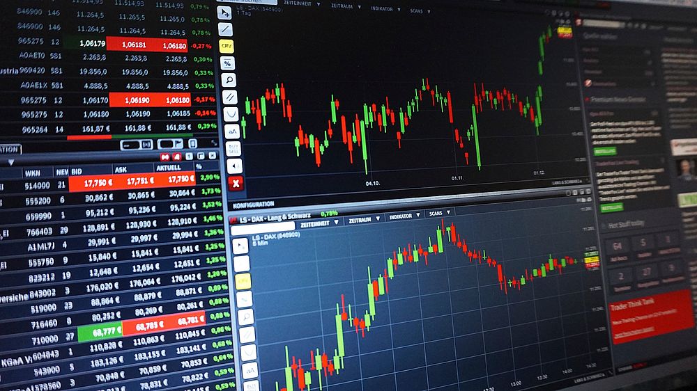
Candlestick charts originated in 18th-century Japan and remain the most popular visualization tool. Each candle represents four data points: open, high, low, and close (OHLC). A bullish candle (usually green or white) indicates the closing price exceeded the opening price. A bearish candle (red or black) shows the opposite. The thin vertical lines—the wicks or shadows—display the intraday extremes. Patterns such as Doji (open and close nearly equal), Hammer (small body with long lower wick), and Engulfing (a candle completely covering the previous one) provide immediate sentiment clues. A single Doji after a prolonged uptrend suggests indecision and potential reversal. Three consecutive Engulfing candles confirm strong momentum. Mastery of candlestick patterns requires memorization of at least 20 basic formations and practice in real-time recognition.
Line, Bar, and Point-and-Figure Charts
Line charts connect closing prices over time, offering a clean view of trend direction but removing intraday noise. Bar charts display OHLC data in horizontal ticks, similar to candles but without the visual body. Point-and-figure charts ignore time entirely, focusing only on price movements of a predetermined magnitude (the box size). They filter out minor fluctuations and highlight support and resistance zones with exceptional clarity. For swing traders, point-and-figure charts eliminate emotional decision-making by displaying only significant price changes. Each method serves a different purpose: line charts for trend identification, bar charts for detailed analysis, and point-and-figure for objective breakout signals.
Trend Indicators: Identifying Direction
Moving Averages (MA)
Moving averages smooth price data to create a single flowing line, revealing the underlying trend direction. The Simple Moving Average (SMA) calculates the arithmetic mean over a specified period. The Exponential Moving Average (EMA) places greater weight on recent prices, making it more responsive to new information. Common periods include the 20-day (short-term), 50-day (intermediate), and 200-day (long-term). A golden cross occurs when the 50-day MA crosses above the 200-day MA, signaling a bull phase. A death cross is the opposite. For active trading, the 9- and 21-day EMAs are widely monitored on hourly and daily charts. When price remains above the 20-day EMA, the trend is considered bullish; prolonged stays below indicate bearish pressure. Moving averages work best in trending markets but generate false signals in sideways, choppy conditions—a limitation every trader must acknowledge.
Moving Average Convergence Divergence (MACD)
Developed by Gerald Appel in the 1970s, MACD is a trend-following momentum indicator. It consists of three components: the MACD line (12-period EMA minus 26-period EMA), the signal line (a 9-period EMA of the MACD line), and a histogram representing the difference between the two. When the MACD line crosses above the signal line, a bullish signal emerges. A cross below the signal line is bearish. The histogram expanding upward confirms increasing bullish momentum; shrinking histogram bars warn of weakening. Divergence between MACD and price is one of the most reliable reversal signals. For example, if price records a higher high while the MACD histogram records a lower high, bearish divergence warns of an impending downturn. Conversely, bullish divergence occurs when price makes a lower low but MACD forms a higher low. MACD is most effective on daily and weekly charts, where it filters out intraday noise and provides robust trend confirmation.
Average Directional Index (ADX)
ADX measures trend strength regardless of direction. It ranges from 0 to 100. Values above 25 indicate a strong trend; values below 20 suggest a weak or ranging market. ADX does not indicate whether the trend is up or down—it only measures intensity. For directional bias, traders pair ADX with the directional movement indicators (DI+ and DI-). When DI+ is above DI- and ADX is rising, a strong uptrend is present. When DI- exceeds DI+, bearish strength dominates. ADX is invaluable for filter decisions: do not trade trending strategies when ADX is under 20, and avoid range-bound strategies above 25. This prevents forcing trades in unfavorable conditions.
Momentum Indicators: Gauging Speed and Strength
Relative Strength Index (RSI)
RSI, created by J. Welles Wilder, measures the magnitude of recent price changes to evaluate overbought or oversold conditions. It is calculated as a ratio of average gains to average losses over a 14-period default. Readings above 70 indicate overbought conditions (potential for reversal or pullback). Readings below 30 signal oversold (potential bounce). In strong trends, RSI can remain in overbought or oversold territory for extended periods—this is not a flaw but a feature. A trader must understand that RSI is a momentum indicator, not a timing indicator. Divergence again provides the strongest signals: if price makes a new high but RSI fails to exceed its previous high, bearish divergence suggests fading momentum. For bullish divergence, price makes a lower low while RSI prints a higher low. During strong uptrends, RSI often stays between 40 and 80, with 50 acting as a support level. In bear trends, RSI struggles to break above 60.
Stochastic Oscillator
The Stochastic Oscillator compares a security’s closing price to its price range over a given period (typically 14). It produces two lines: %K (the fast line) and %D (a moving average of %K). Values above 80 define overbought territory; below 20 indicates oversold. Like RSI, Stochastic can stay in extreme zones during strong trends. The key signal is a crossover: when %K crosses above %D in oversold territory, a buy signal emerges. A cross below %D in overbought territory signals a sell. Stochastic is particularly useful in ranging markets, where it excels at identifying turning points. In trending markets, traders should use longer settings (e.g., 21, 14, 14) to reduce false signals. Also, look for “hidden” divergence: in an uptrend, if price forms a higher low but Stochastic forms a lower low, it indicates weakening buying pressure and potential bearish reversal.
Commodity Channel Index (CCI)
CCI measures the deviation of price from its statistical mean. Developed by Donald Lambert, it identifies cyclical extremes. Values above +100 suggest overbought conditions; below -100 indicate oversold. CCI is especially effective for detecting breakouts. When CCI moves from negative territory to above +100, it signals strong buying pressure. A drop from above +100 to below -100 reveals heavy selling. CCI also generates divergence signals similar to RSI and MACD. Because CCI oscillates around zero, a centerline cross (moving from negative to positive) serves as a confirmation of trend change. Traders often use a dual-CCI system: a fast (5-period) and slow (14-period) CCI to create crossover signals.
Volume Indicators: Confirming Participation
On-Balance Volume (OBV)
OBV, created by Joseph Granville, adds volume on up days and subtracts volume on down days. The cumulative total forms a line that should move in the same direction as price. If price rises but OBV declines or stays flat, it signals distribution—large players are selling into strength. This bearish divergence warns of a potential top. Conversely, if price falls but OBV rises, accumulation is underway, suggesting a bottom may be near. OBV is a leading indicator; it often turns before price. Trendline breaks on the OBV line are often more reliable than on price itself. For daily trading, watch for OBV making new highs before price does—this confirms strong buying interest.
Volume Price Trend (VPT)
VPT links percentage price changes with volume. It is computed by multiplying the percentage change in price by the volume, then adding or subtracting this product to a running cumulative total. When VPT rises faster than price, volume is validating the move. When price rises but VPT trends lower, a bearish divergence emerges. VPT is less common than OBV but provides smoother signals with less noise. For best results, use VPT on daily and weekly charts. A VPT breakout, where the indicator exits a multi-month consolidation, often precedes substantial price moves.
Accumulation/Distribution Line (A/D)
The A/D line (A/D Line) uses both the closing price’s proximity to the day’s high and low and the volume to gauge money flow. If a stock closes near its high, it is marked as accumulation; near the low, distribution. The cumulative line rises when accumulation dominates and falls when distribution prevails. Like OBV, divergence between A/D and price is a powerful warning. A rising price but falling A/D suggests that institutions are quietly distributing shares, a precursor to a selloff. The A/D line is most robust on daily and weekly timeframes and should always be checked before entering a position.
Volatility Indicators: Measuring Risk
Bollinger Bands
Developed by John Bollinger, these bands consist of a middle line (20-period SMA) and two outer bands set at two standard deviations above and below. When volatility increases, bands widen; when volatility contracts, bands narrow. Price touching the upper band does not automatically mean overbought—in strong trends, price can “walk the band” for days. The key signal comes from “the squeeze”: when bands narrow dramatically, a violent price expansion often follows. The direction of the breakout is not given by the bands themselves—traders must combine with other indicators. A squeeze, followed by a close outside the upper band on rising volume, signals a powerful bullish move. Bollinger Bands also act as dynamic support and resistance. In a pullback, the middle band (20 SMA) often holds as support in uptrends. For mean-reversion strategies, a sharp touch of the lower band followed by a bullish RSI divergence is a classic setup.
Average True Range (ATR)
ATR measures market volatility by calculating the average range between high and low over a specified period (typically 14). It does not indicate direction—only how much price moves on average. A rising ATR tells traders to widen stop-losses and position sizes to accommodate volatility. A falling ATR signals declining volatility, often preceding a breakout. For position sizing, a common rule is to risk no more than 1-2% of account equity per trade, computed as ATR multiplied by a chosen multiple (e.g., 2x ATR). An ATR reading at multi-month lows suggests a quiet market about to explode. During high ATR readings, traders should reduce leverage and avoid adding new positions.
Keltner Channels
Keltner Channels use an EMA (typically 20) as the centerline and the Average True Range to set bandwidth (usually 2x ATR). Unlike Bollinger Bands, which use standard deviation, Keltner Channels are less sensitive to extreme outliers. They are particularly effective for identifying trend strength: in an uptrend, price tends to stay between the upper channel and the EMA. A close above the upper channel signals powerful momentum; a close below the lower channel highlights strong selling pressure. Keltner Channels work well in combination with Bollinger Bands: when Bollinger Bands are wider than Keltner Channels, volatility is expanding; when narrower, volatility is contracting. This comparison can forecast breakouts.
Oscillators and Ranges: Timing Entry and Exit
Williams %R
Williams %R, developed by Larry Williams, measures overbought and oversold levels on a scale from 0 to -100. Readings above -20 are overbought; below -80 are oversold. The signal occurs when the line turns up from below -80 (bullish) or down from above -20 (bearish). Unlike RSI, Williams %R tends to produce more frequent extreme readings, making it more suitable for short-term trading. A common strategy is to wait for a dip below -80, then enter long after Williams %R crosses back above -80. For short entries, the opposite applies. Divergence signals with Williams %R are among the most reliable for catching reversals on 15-minute and 60-minute charts.
Money Flow Index (MFI)
MFI is a volume-weighted version of RSI. It incorporates both price and volume to measure buying and selling pressure. Values above 80 indicate overbought; below 20 indicate oversold. Because volume is included, MFI is less prone to false extremes than RSI. A bearish divergence occurs when price makes a higher high but MFI forms a lower high—indicating that volume is not confirming the move. For bullish divergence, price makes a lower low while MFI prints a higher low. MFI is most effective on daily charts for identifying trend exhaustion. When MFI enters overbought territory after a long uptrend and then drops back below 80, it often marks a significant top.
Fisher Transform
The Fisher Transform normalizes price data to create a Gaussian probability distribution. It highlights when prices have moved to an extreme, suggesting a reversal. The indicator oscillates between -5 and +5. Values above +2 suggest overbought extremes; below -2 suggest oversold extremes. The Fisher Transform is renowned for its sharp turning points. A crossover of the Fisher line above its signal line (a moving average of itself) after a reading below -2 generates a powerful buy signal. The opposite crossover above +2 indicates a sell. Because the Fisher Transform is designed to turn at extremes, it often catches major tops and bottoms earlier than RSI or Stochastic. It is less effective in slowly trending markets but excels in volatile, mean-reverting conditions.
Combining Indicators for Robust Signals
No single indicator is infallible. Smart trading requires confluence—multiple indicators aligning on the same signal. For example, a buy setup might include: price above the 20-day EMA (trend confirmation), RSI bullish divergence (momentum shift), OBV making a new high (volume confirmation), and Bollinger Bands squeezing (volatility contraction). The more independent indicators agree, the higher the probability of a successful trade. Avoid overlapping indicators of the same type—combining RSI with Stochastic is redundant. Pair trend with momentum, volume with volatility. A common robust combination: MACD for trend momentum, ATR for stop placement, and OBV for volume validation. Backtest each combination on your chosen asset and timeframe before committing capital.
Common Mistakes and How to Avoid Them
Overcomplicating charts with too many indicators leads to analysis paralysis. Stick to a maximum of three indicators per timeframe. Chasing indicator signals without considering market context is equally dangerous. A bullish RSI divergence in a strong bear market often fails—the larger trend dominates. False signals are inevitable; risk management protects capital. Always set a stop-loss based on ATR or key support/resistance levels, not on arbitrary percentages. Avoid “curve fitting”—adjusting indicator parameters to fit historical data perfectly. Default settings (14-period RSI, 26/12/9 MACD) are robust for a reason; changing them without statistical justification usually degrades performance.
Essential Resources for Continued Learning
StockCharts.com offers free charting with all major indicators pre-loaded. TradingView provides community-generated scripts and real-time data. Books such as Technical Analysis of the Financial Markets by John Murphy and Encyclopedia of Chart Patterns by Thomas Bulkowski serve as foundational references. Practice on a paper trading account for at least 100 trades before risking real money. Review every trade, especially losers, to identify which signals misled you. Technical analysis is a skill honed through thousands of hours of chart time, not overnight reading.


