


How to Read Forex Charts: A Trader’s Technical Analysis Primer
1. The Cartesian Foundation: Price and Time as Coordinates
Every Forex chart is a Cartesian plane. The vertical axis (y-axis) represents price, measured in pips or points. The horizontal axis (x-axis) represents time, moving chronologically from left (past) to right (present). This simple coordinate system is the bedrock of technical analysis. By plotting price against time, you create a visual history of market sentiment—fear, greed, indecision, and aggression—all captured in the oscillation of a line or the body of a candle. Understanding this foundational geometry is non-negotiable. Without it, you are looking at noise, not signal.
2. Chart Types: Line, Bar, and Candlestick—The Triad of Visualization
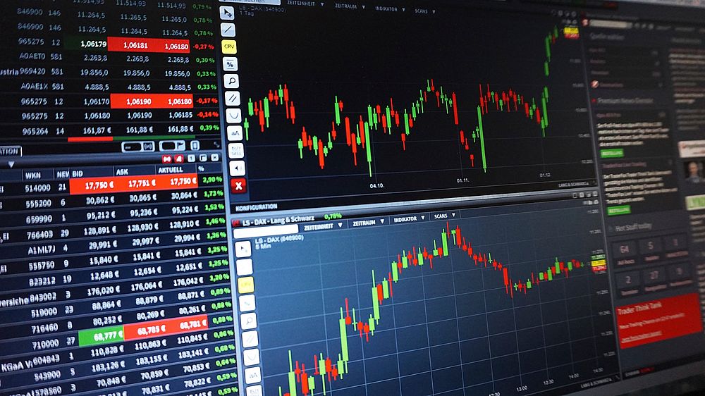
Three primary chart types dominate the Forex landscape. The line chart connects closing prices over a set period. It offers the cleanest view of a trend but sacrifices intra-period volatility. The bar chart (OHLC) provides four data points per period: Open, High, Low, Close. The vertical line shows the range; the left tick marks the open; the right tick marks the close. The candlestick chart, developed by Japanese rice trader Munehisa Homma in the 18th century, is the most popular. Each candle has a real body (the distance between open and close) and wicks (shadows) showing high and low. A green or white body indicates a close above the open (bullish); a red or black body indicates a close below the open (bearish). Candlesticks are superior for pattern recognition because the body-to-wick ratio instantly communicates market tension.
3. Timeframes: The Spectral Lens of Analysis
Forex charts are fractal. Patterns visible on a 1-minute chart exist, in diluted form, on a weekly chart. Timeframes are categorized into three tiers. Lower timeframes (M1, M5, M15) are for scalpers and day traders who execute dozens of trades daily. Intermediate timeframes (H1, H4) suit swing traders holding positions for days. Higher timeframes (D1, W1, MN) are for position traders and investors. The golden rule: analyze in higher, execute in lower. Identify the major trend on the daily chart, then use the 4-hour or 1-hour chart to time your entry. Multiple timeframe confluence—where a setup aligns across two or three timeframes—dramatically increases probability.
4. Trend Identification: The Market’s Dominant Narrative
A trend is simply a series of higher highs and higher lows (uptrend) or lower highs and lower lows (downtrend). Uptrends are characterized by rising peaks and valleys; each pullback fails to reach the previous low. Downtrends show falling peaks and valleys; each rally fails to surpass the prior high. Sideways trends (ranges) occur when price oscillates between horizontal support and resistance with no clear directional bias. To draw a trendline, connect at least two major swing points (lows in an uptrend, highs in a downtrend). The more touches the line has, the more significant it is. A breach of a long-standing trendline warns of a potential reversal or acceleration.
5. Support and Resistance: The Invisible Floors and Ceilings
Support is a price level where buying pressure is strong enough to overcome selling pressure, halting a decline. Resistance is a level where selling pressure overcomes buying, halting an advance. These levels are not arbitrary; they represent zones where institutional order flow clusters. When price breaks through resistance, that level often flips to become new support—a concept known as role reversal. The most robust support and resistance levels are those tested multiple times, round numbers (psychological levels like 1.2000 or 110.00), and levels coinciding with major moving averages. Volume profile analysis can confirm these levels by showing high-volume nodes.
6. Candlestick Patterns: The Micro-Market Psychology
Single-candle patterns offer immediate sentiment data. A doji (open and close virtually equal) signals indecision, often preceding a reversal. A hammer (small body, long lower wick) indicates buying after a sell-off. A shooting star (small body, long upper wick) suggests selling after a rally. Multi-candle patterns are more reliable. The engulfing pattern: a small bullish candle followed by a larger bearish candle that completely engulfs it (bearish reversal), or vice versa (bullish reversal). The morning star (three candles: long bearish, small indecisive, long bullish) is a powerful bottom reversal signal. Never trade a single pattern in isolation; confirm with trend or support/resistance.
7. Moving Averages: Dynamic Gauge of Direction and Momentum
Moving averages smooth out price data to filter noise. The Simple Moving Average (SMA) gives equal weight to all periods. The Exponential Moving Average (EMA) gives more weight to recent prices, making it more responsive. Two primary uses: trend direction (price above a rising 200-EMA confirms a long-term uptrend) and dynamic support/resistance (the 50-EMA often acts as a bounce point in trends). A golden cross occurs when the 50-period MA crosses above the 200-period MA—bullish. A death cross is the opposite—bearish. The 20-EMA and 50-EMA are staples for swing traders; the 200-EMA is the institutional benchmark.
8. Relative Strength Index: Momentum and Overbought/Oversold Conditions
The RSI is a momentum oscillator ranging from 0 to 100. Readings above 70 suggest overbought conditions (potential for a pullback or reversal). Readings below 30 suggest oversold conditions (potential for a bounce). However, in strong trends, the RSI can stay overbought or oversold for extended periods. The real power lies in divergence. Bullish divergence: price makes a lower low while RSI makes a higher low—indicating weakening bearish momentum, a precursor to an upside reversal. Bearish divergence: price makes a higher high while RSI makes a lower high—signaling weakening bullish momentum. Divergence is one of the most reliable leading indicators in Forex.
9. Moving Average Convergence Divergence: Trend and Momentum Combined
MACD consists of a fast line (12-period EMA minus 26-period EMA) and a slow line (9-period EMA of that difference), with a histogram showing the distance between them. When the fast line crosses above the slow line, it signals bullish momentum (buy signal). A cross below signals bearish momentum (sell signal). The histogram expands when momentum accelerates and contracts when it decelerates. Zero-line crosses are significant: the MACD line crossing above zero indicates the average trend is turning bullish; crossing below zero indicates bearishness. MACD is best used in ranging markets or to confirm trend strength, not as a standalone entry tool.
10. Fibonacci Retracement: The Mathematical Fear and Greed Levels
Fibonacci retracement levels (23.6%, 38.2%, 50%, 61.8%, 78.6%) are derived from the golden ratio (1.618). In an uptrend, after a price advance, traders expect a pullback to one of these levels before the trend resumes. The 61.8% level is considered the “golden zone”—a deep but healthy retracement. If price breaks below the 78.6% level, the trend may be invalidated. To draw a Fibonacci retracement, identify a significant swing low to swing high (in an uptrend) or high to low (in a downtrend). Combine Fibonacci levels with support/resistance for high-probability confluence. The 38.2% and 61.8% levels are the most frequently traded.
11. The Principle of Confluence: Stacking the Odds
No single indicator or pattern is reliable above 60% in Forex. Confluence is the alignment of multiple independent technical factors at the same price level. For example, a buy setup might include: (1) a 61.8% Fibonacci retracement, (2) a prior horizontal support level, (3) a bullish engulfing candlestick pattern, (4) RSI bullish divergence, and (5) price bouncing off the 200-EMA on the 4-hour chart. Each added layer of confluence increases the probability of a successful trade. Avoid trading on isolated signals. The market is a complex adaptive system; confluence is your cheap edge.
12. Price Action: The Master Read Without Lag
Price action is the purest form of technical analysis—reading raw candlesticks, trendlines, and levels without oscillators or lagging indicators. It relies on pattern recognition of market structure (swing highs and lows), pin bars (single candles with long wicks showing rejection), and inside bars (a candle completely within the range of the prior candle, indicating consolidation before breakout). Price action traders ignore noise and focus on institutional footprints. Master price action first; then add indicators as filters, not crutches. The most successful traders often use only a clean chart with naked candlesticks and trendlines.
13. Common Pitfalls: Avoiding Chart Reading Errors
Curve-fitting: Adjusting indicators to perfectly fit historical data, which fails in live markets. Analysis paralysis: Using too many indicators that contradict each other, leading to indecision. Ignoring higher timeframe context: Taking a buy signal on a 15-minute chart while the daily chart shows a clear downtrend. Trading through news: Fundamental releases cause unpredictable spikes that liquidate technical positions. Confirmation bias: Only seeing patterns that support your existing position. Overtrading: Mistaking noise for signal, especially in low-volatility periods. Develop a systematic checklist and adhere to it rigidly.
14. Building Your Chart Reading Routine
Begin each session with a top-down analysis: (1) Open the daily chart and identify the dominant trend and key support/resistance zones. (2) Drop to the 4-hour chart and mark significant Fibonacci retracements and moving averages. (3) Move to the 1-hour chart to assess momentum using RSI and MACD. (4) Identify potential confluence zones where multiple factors align. (5) Wait for a price reaction (e.g., a bullish engulfing candle at a confluence zone) before entering. This systematic approach removes emotion and forces you to trade the plan, not the impulse.
15. Practical Application: A Hypothetical Trade Setup
Consider EUR/USD on the daily chart: price is in a clear uptrend, making higher highs and higher lows. On the 4-hour chart, price pulls back to the 61.8% Fibonacci retracement of the last swing low to high. This level coincides with a prior resistance-turn-support zone at 1.0850 and the 200-EMA. The RSI on the 4-hour chart shows bullish divergence (price lower low, RSI higher low). You see a bullish engulfing candle form at this zone on the 1-hour chart. Your entry: long at the close of the engulfing candle. Stop loss: below the recent swing low (approximately 20 pips). Target: the previous swing high (approximately 60 pips). Risk-to-reward ratio: 1:3. This trade has high confluence across timeframe, Fibonacci, support/resistance, RSI divergence, and candlestick pattern. Execute only when all conditions are met.
16. The Role of Volume in Forex Charts
Forex is decentralized, so no centralized volume data exists. Instead, traders use tick volume (number of price changes) from platforms like MetaTrader, or volume footprint from futures-based data (e.g., Euro FX futures on CME). High tick volume at a support level indicates strong buying pressure; low volume on a breakout suggests a false move. Volume Profile (a histogram showing volume at specific price levels) can reveal high-volume nodes (areas of institutional interest) and low-volume nodes (areas of rapid price movement). While less precise than equity markets, volume analysis adds a critical layer of confirmation in Forex.
17. Adapting to Market Regimes: Trending vs. Ranging
No chart reading method works in all conditions. Trending markets favor trend-following tools (moving averages, trendlines, MACD). Ranging markets favor mean-reversion tools (RSI, stochastic, support/resistance breakouts). The Average Directional Index (ADX) measures trend strength: above 25 indicates a strong trend; below 20 indicates a ranging market. In a strong trend, fade counter-trend signals and ride with momentum. In a range, buy at support and sell at resistance. Misidentifying the regime is the fastest way to lose capital. Periodically assess the ADX and price structure to determine your approach.
18. The Mental Game: Chart Reading as Discipline
Technical analysis is 20% methodology and 80% psychology. You can read a chart perfectly yet lose money due to fear of missing out, revenge trading after a loss, or failing to place a stop loss. Treat each trade as a discrete experiment: the outcome is probabilistic, not predetermined. A losing trade on a high-confluence setup is valid; a winning trade on a low-confluence lottery is a trap. Journal every trade with a screenshot of the chart, your rationale, and your emotional state at entry and exit. Over time, patterns in your decision-making will emerge. The chart is a mirror; it reflects your biases, discipline, and preparation. Read it honestly.